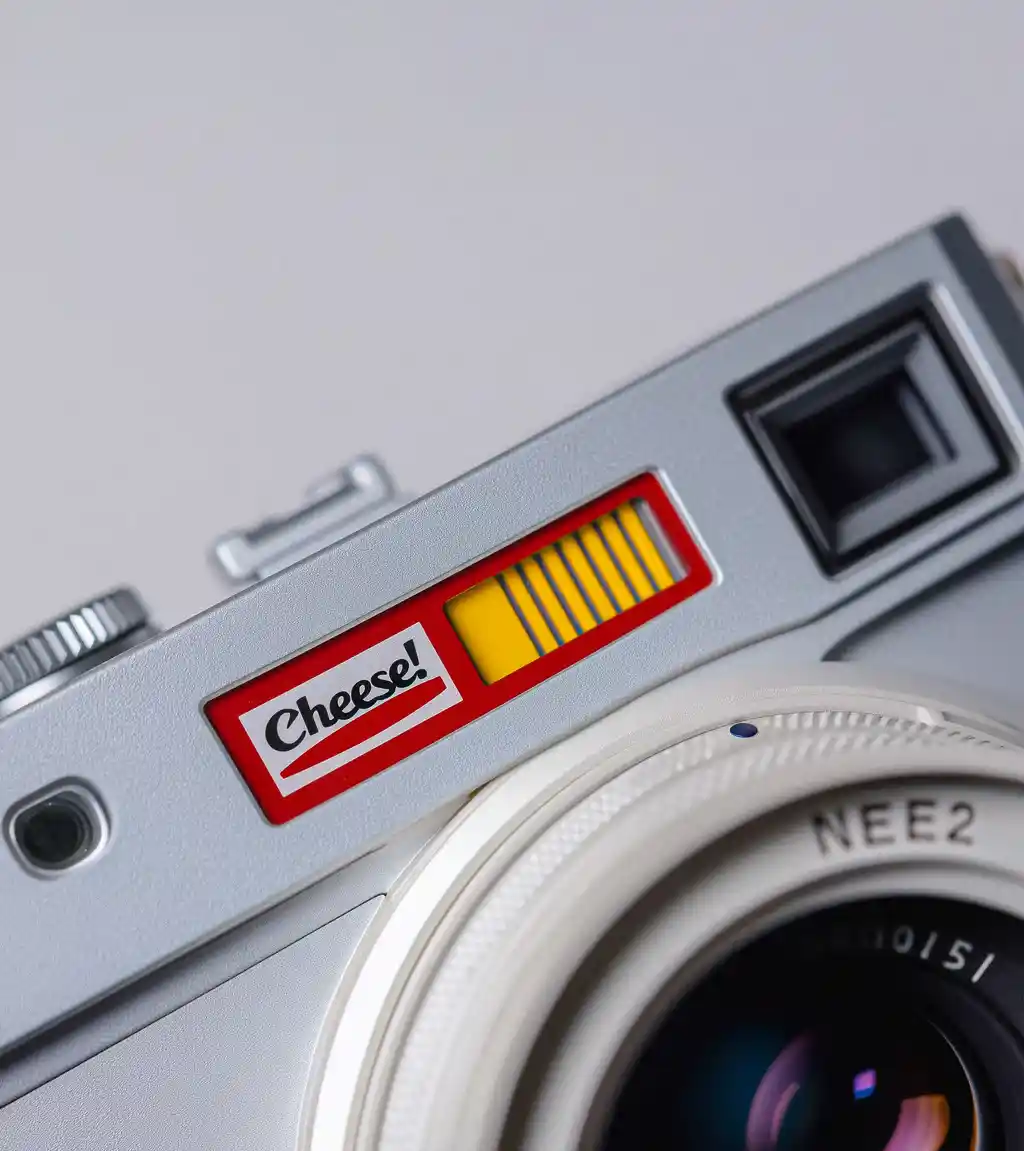
The Visual Cues of Trust
Trust is emotional, not rational. And the aesthetic of a trustworthy brand has surprisingly little to do with looking “premium” or “clean.”
It’s about context. Resonance. Alignment.
✅ Familiar layout,
✅ Thoughtful microcopy
✅ Iconography that feels right, ✅ Typography that’s not trying too hard
The Problem with “Minimal”
Too many crypto projects mistake minimalism for credibility. White backgrounds, light grays, and a bunch of Futura. But if it looks like everything else, it feels like everything else. And that’s not how trust is built.
Clarity is trust, And clarity is visual
What Actually Works
- Consistent brand voice
- Social proof in context
- Subtle cues of effort (the details most don’t bother with)
- Contrast (in design, message, and experience)
Branding for the Crypto-Cynical
The Web3 audience is skeptical. They’ve seen the rugs, the fake hype, the anonymous teams. Your branding needs to show effort without trying to oversell.
Don’t scream. Just show up with presence and care.
Final Takeway
Your design doesn’t need to impress everyone.
It just needs to make your people feel like they’ve found something that gets them—and won’t disappear tomorrow.


